

Dulux Colour of the Year 2022; Bright Skies - The Year of Optimism?
Bright skies for brighter times? We would like to hope so.
I think that’s the vibe Dulux were going for when they selected the colour of the year for 2022. This bright, fresh, subtle blue portrays optimism, joy, space and calm; all of the good things, and quite the palette cleanser to the ‘Brave Ground’ of 2021 (although I actually really liked this colour and wrote all about it here.)

Dulux Bright Skies, image via dulux.co.uk
The pandemic forced us to see our homes in a different light, literally, physically, a different light. Most of us rarely saw our homes in daylight between Monday and Friday, due to our normal working hours pre-Covid, leaving for work before day break and arriving home to the same darkness. But the lockdown, furlough and working from home meant being at home during those godly hours (much to my enjoyment), which shone a light on our furniture layouts, and put our home’s efficiency levels to the test.
Since we had to stare at the same walls day in day out, we’ve scrutinised our decor choices, wall colours, furniture situations, and it all left us wondering how and why we’ve lived with such compromised design for so long. Bright skies is a response to those lockdowns, uncertain times and moments of questionable work space evaluations. It soon confirmed that working on my laptop from my sofa was doing my back, shoulders and posture no favours at all.
“Right now, people want to feel revitalized and enjoy the freedoms that are returning to them, to look out and bring in new ideas. What better inspiration can we take than the endless skies around us?”
Interior decoration is on the up. If we didn’t before, we now hold our homes in very high regard. We’ve put our interiors on a pedestal and realised that our environment does in fact have a direct affect on how we function, and how we feel.
Dulux Bright Skies is the colour of the sky, openness, and fresh starts. I personally feel that pale blue shade is easy to use and incorporate into the home, or am I biased, as its one of my favourite colours? It’s a colour that can be used to give just a hint of freshness, or conversely, make a major statement.
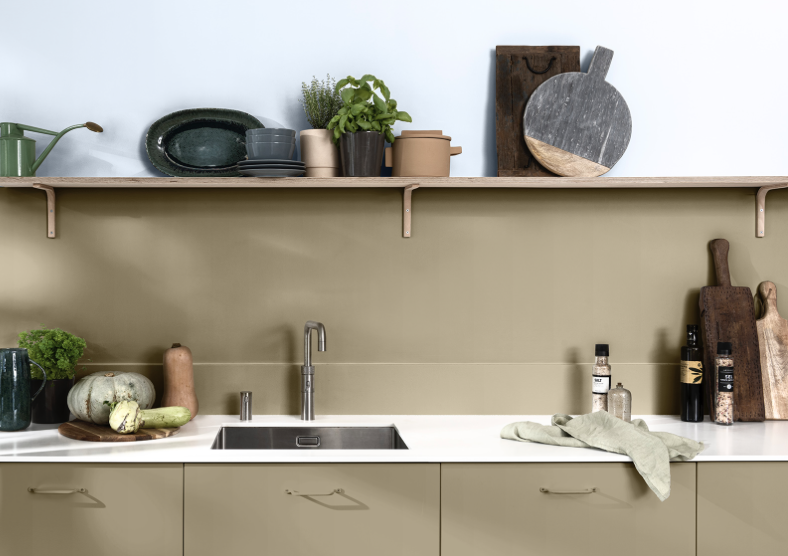
Dulux Bright Skies with Red Earth from the Dulux ‘Greenhouse’ palette
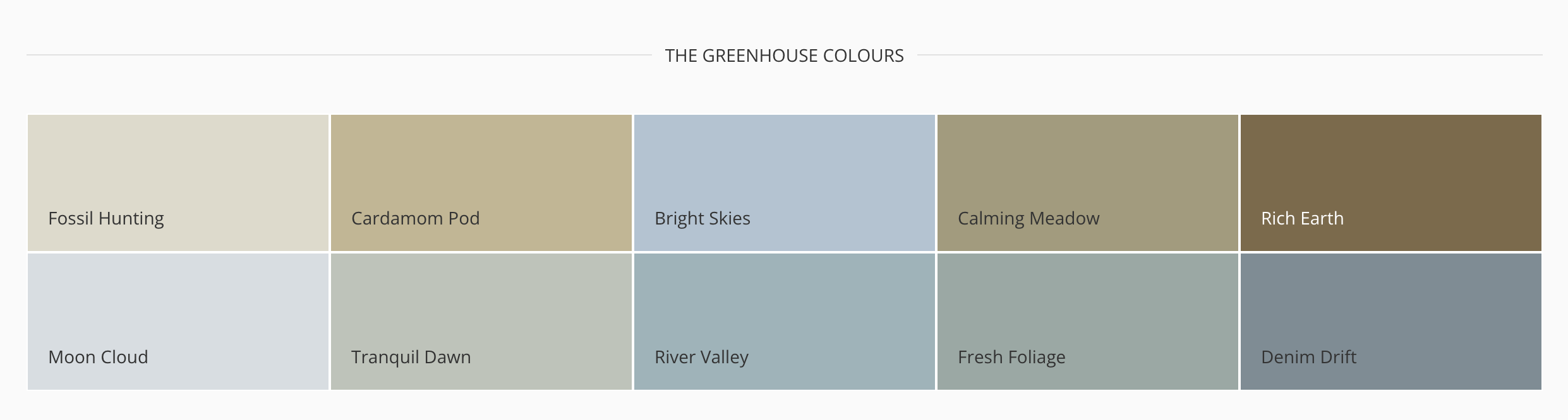
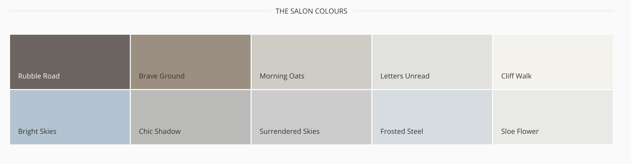
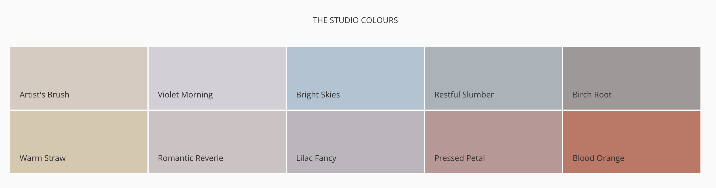
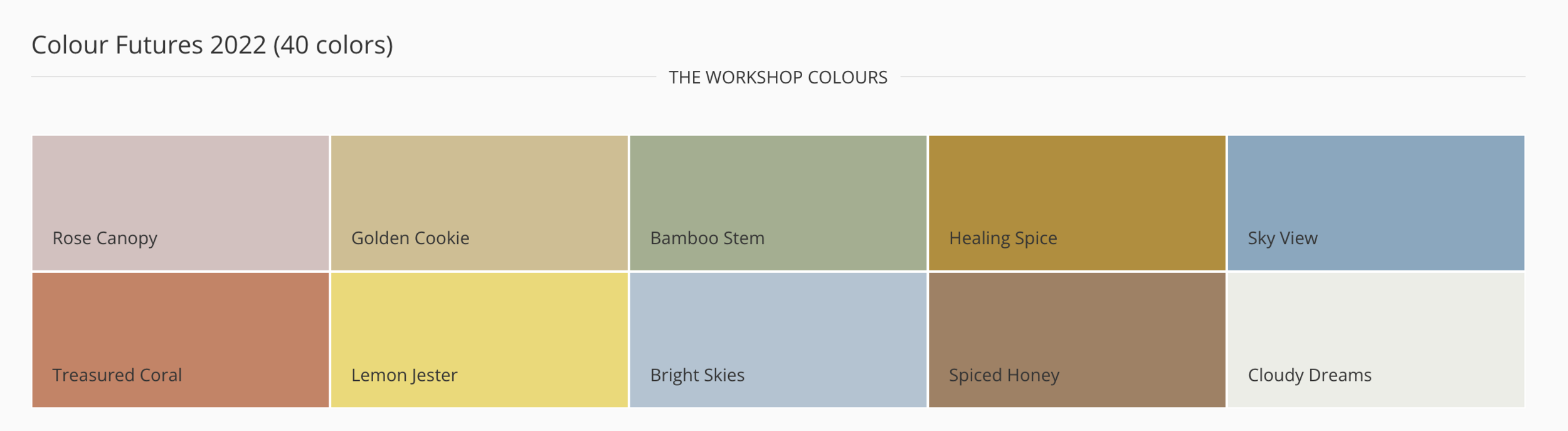
Alongside this COTY, Dulux have curated four palettes that work beautifully with the hue; the ‘Greenhouse’ palette, the ‘Salon’, ‘Studio’ and ‘Workshop’, but don’t for a second feel confined to these groups of colour, these have been grouped as a guide to whet your colour appetite.
I’ve read that some industry experts have described the colour as ‘too cool’, and not highly versatile, but I think that exactly because Bright Skies is so pale, fresh and ‘cool’, it can be easily paired with strong bold colours. Take the image below, the home of photographer Celine Hallas. The pale blue ceiling works artfully alongside sunshine yellow, terracotta and chocolate brown - a winner of a combination I would say, and proof of the hue’s versatility.
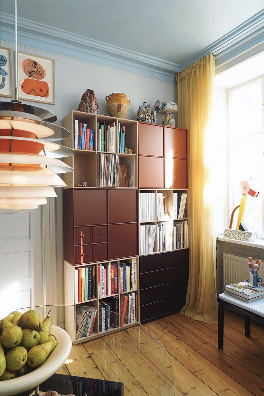
The home of @celinehallas
It’s also a great way for colour-shy folk to introduce a hint of hue into their environment. Look at how Stylist & Designer Tone Kroken uses the shade in her hallway. The beautiful paint effect goes all the way up to the ceiling and works in harmony with the pale herringbone wood floor. The perfect bright and tranquil shade to welcome you home.

Tone Kroken making a statement in this hallway
A favourite colour grouping of mine is pale blue with deep, rich reds. In fact, Studio Sam Buckley nails this combination in the image below. This is a palette that I’m looking to use in my living room, a room which isn’t necessarily full of light, but the stark combination of rich red vs cool blue is a tension that I love.

Studio Sam Buckley tearing up the rule book with this magnificent colour combination
Another one of my favourite uses of the colour is by the fabulous 2LG Studio, using an out-and-out monochromatic scheme of Bright Skies from the walls, to the fireplace, the bed upholstery, right through to colour-matching it with Carpetright with their flooring. LOVE.

The Topps Tiles Tile of the Year 2022 goes hand in hand with the colour, with their ‘Flute’ tile in Bright Skies. The metro style rectangular tile incorporates another major trend for the year, a ridge or flute giving the tile it’s interesting texture, in a soft matte finish.
“Its reeded 3D structure has echoes of the luxury of the Art Deco era, creating movement and in turn, depth, and interest. The texture enlivens the colour, providing a tactile surface for those looking to create dimension in their tiled space whilst its inimitable ultra matt finish feels as soft as suede.”

‘Flute’ tile in Bright Skies by Topps Tiles
If you’re like me, and enjoyed the company of this pale blue hue in the home already, then get ready as we’re in for a treat. We will see the Bright Skies shade become popular in homewear products, accessories, wallpapers and fabrics over the course of the coming year, and I’ve found some pretty cool treasures already! Here’s an edit of some of my favourite pale blue interior items, with links below for ease of shopping as always :)

The LLG Bright Skies Interior Edit
Pietra Blu Wallpaper - Susi Bellamy
E27 pendant lamp - Muuto - Nordic Nest
Genie In a Bottle Gingham vase - Vaisselle - Liberty
Only Me Mirror - Pale Blue - 50x70cm - Kartell - Made In Design
Ruched cobalt Strata velvet cushion - Susi Bellamy
W&S Soft Candle holder - Hay
Petite Pauline Candlestick Holder - Maison Balzac - Liberty
Volute candles set of 2 - Maison Balzac - Liberty
Casca glass - Ferm Living
Marguerite side plate - Vaisselle - Liberty
Braid photo frame - &Klevering - Trouva
Blue and white small chalice bowl - Henry Holland Studio - Liberty
Rico Divan Tonus sofa - Ferm Living - Earl of East
Circus pouf - Norman Copenhagen- Nordic Nest
Bright Skies - Dulux
I’d love to hear how you feel towards Bright Skies and if you are drawn to using pale blue tones in your home. If you would like to use the shade but don’t quite know where to start, get in touch here, I would love to help you.

