

Dulux Colour Of The Year 2021; Brave Ground - The Colour That Divided Instagram
Can you remember what you were doing at the time of the Dulux COTY reveal last year?
I was sitting at my desk in our shared agency office in Manchester’s Northern Quarter, surrounded by my team positioned less than one meter away, hugging my colleagues and friends, going out for lunch and socialising after work. I would never have thought that for this year’s reveal I would be sitting in my pjs at home, hair unwashed, make-up free for so long that I’ve forgotten how to apply eyeliner and, alone.
So what do what the Dulux team have in store for us in 2021?
A shade called ‘Brave Ground’; a warm neutral that connects us to our foundations. Creative Director Marianne Shillingford describes the colour as ‘the mother earth of colours’, a soothing, grounding colour that reconnects us with nature in a non obvious way, from the ground up.

‘Brave Ground’ - Dulux Colour of the Year 2021
It seems a lifetime ago since Tranquil Dawn was deemed the new shade . Since then we’ve been locked down, released with restrictions, and locked down again, spending unusually large amounts of time at home, sometimes going insane, and oftentimes loving the opportunity to ‘stay in’.
The colour was chosen before we even knew that the word ‘Covid’ existed, but Dulux felt that their decision didn’t need to be reconsidered post-pandemic. To me, the colour feels very appropriate to how a lot of us are feeling, i.e, staying in = the need to be cosy & comfortable = the longing for warmth.
The shade was released by Dulux two days ago, and the colour choice has certainly split opinions this year! To an extent, I can understand why. 2020 has turned us into very opinionated individuals, polarised with what we’ve been seeing on the news, and we’ve been sharing our strong feelings about many topics from home.

Each colour from all four palettes are featured in these painted accessories
I can see why a lot of people were expecting something bold and striking, but WOW, I can’t believe some of the comments I’ve read already about this colour! My Insta stories have been rife with negativity for the shade (I’ve had to unfollow/mute a few people because of it!) - come on guys, where is your imagination?!
Even some of my friends have said that they are surprised that I like the colour - they see me as a person who is all about bold, bright, adventurous decorating and brave styling. But hang on a minute, who said we were ever going to look at a COTY in isolation? Brave Ground, like all Colours Of The Year, each year, is meant to be viewed based on the story behind it, which is thoroughly researched by the colour experts;
“‘a bolstering shade that connects back to nature and the simple things. A warm, earthy tone, it creates a feeling of stability, growth and potential; and provides a firm foundation for change and creativity in your home’”
Key word here people - ‘bolstering’! Marianne also uses the word ‘supporting’. This colour is not meant to be used in isolation, but as a great backdrop just waiting to be teamed with bright and rich colours for it to really come into its own.
How should we use it?
Well, however suits you and your style! But Dulux have created 4 different palettes to give us some inspiration, each palette including 10 colours where Brave Ground has a different role to play.
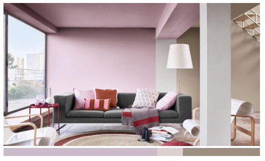
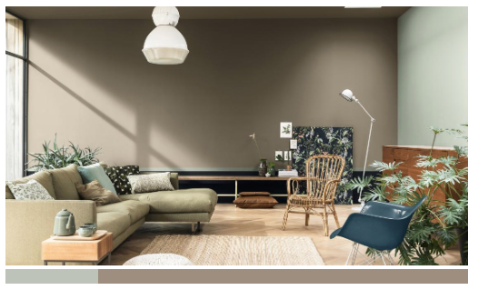
Expressive Colour Palette
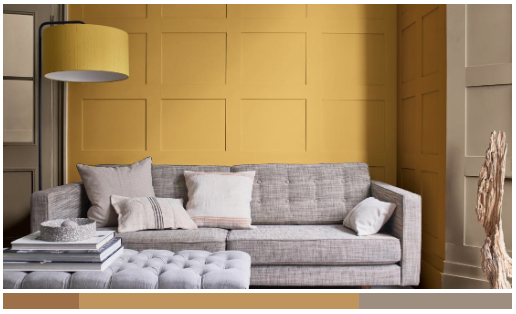
First of all, and my personal favourite palette; ‘Expressive’, a gorgeously elegant collection of colours including hot pinks, oranges and lilacs - it’s certainly the boldest collection of shades out of the four.

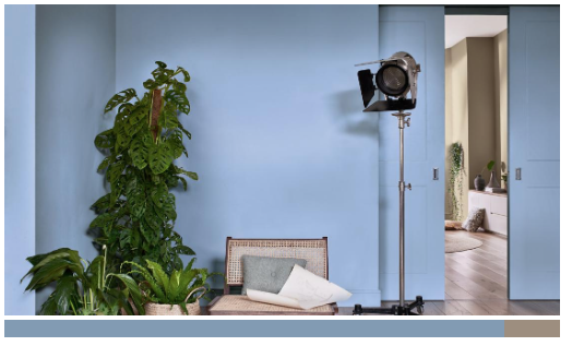
Trust Colour Palette
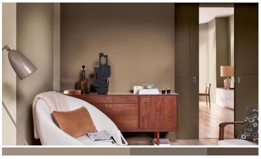
Then there’s the Trust palette. This one is probably the least ‘me’ due to its very cool Scandi vibe. Perfect for those minimalists out there who love a bit of Danish furniture, bleached woods and natural materials like jute, rattan and clay.

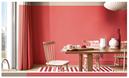
Timeless Colour Palette
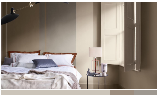
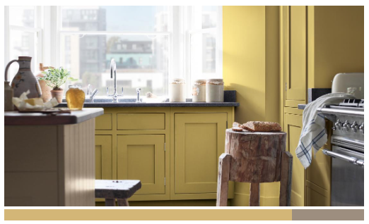
Number three; the Timeless palette, which gains its warmth from the pops of mustard, saffron and rust. This again is quite a pared back palette, perfect for those who want to use some bold colour, but not go too wild. This combination of colours has such a warm, cocooning feel.

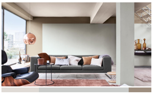
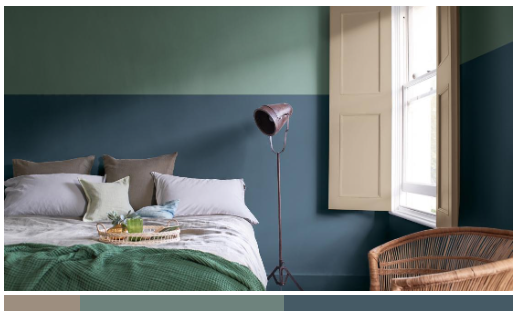
Earth Colour Palette
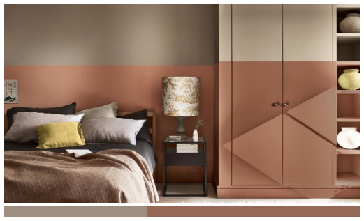
And finally, the Earth palette, which is my second favourite after Expressive. I love dark inky blue hues, and with the hints of dusty green and powder blue it gives an elegantly modern, grown up feel.

How would I use it in my home?
Brave Ground is refined, quiet and peaceful, all the things that we’ve come to value so much more this year. FOMO is out, safety and feeling connected is in. The words that the colour conjures up for me are:
Luxury, Romantic, Decadent, Velvet, Glamourous, Peaceful, Warming,, Elegant, Fashionable,
and I wanted to create a moodboard showing you how I would use the colour in my home, to combine all of these feelings.

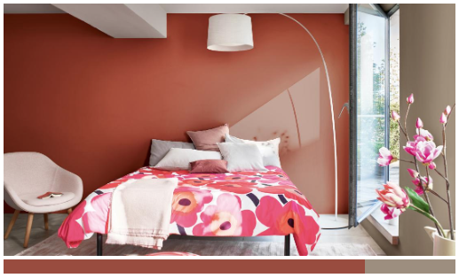
Moodboard for a dream bedroom using Dulux Brave Ground as the backdrop shade.
Do you agree that Brave Ground looks warm and inviting in this luxurious bedroom space? Burgundy, red, pink, orange and golds compliment the shade so beautifully. Together they create a colour scheme that looks really high end, and STILL BOLD! The Painted Journey Organic Tana Lawn™ Cotton fabric from Liberty used as a curtain includes practically every colour from the Expressive palette, whilst Brave Ground acts as the perfect canvas to hold all of the richness together. I think the scheme would look beautiful with elaborate wall mouldings, depicted here in ‘Caramel Fudge’.
The magnificent Maracanda Etro wallpaper (scroll to the bottom of the post for the full shopping list) with Wendy Morrison’s Peace Love & Joy rug and fully upholstered Dozer bed in Merlot velvet by Loaf, brings all the glamorous fashion feels. This is a space that I would feel restful and safe in, and 100% chic.
The colour that divided Instagram!
I’ve heard people saying that that they would never use brown in the home, but just pause for a moment; doesn’t your home include any wood? What about your internal doors? No stone? No warmth? Remember, colour is not not just about the walls, think about the floor, the woodwork, the accessories, the feeling and the natural elements like the wood of your plants. There’s probably more brown in your home than you think.
Dulux are only encouraging us to think about colour in different ways. Yes, the Colour of the Year is a trend, and we can take or leave that trend, but every now and then its nice to be challenged by thinking how a colour can be teamed with others, to create something that we wouldn’t have necessarily thought up our selves.
In a nutshell, the colour itself might not be ‘Brave’ (Ground) but come people, why don’t you show your Brave side by using your imagination and putting other colours with it! Who said we need to paint our whole house in this colour!? Think about how the brights and the pastels, the blacks and the creams will sit next to it, in my opinion its just fabulous. I’m going to take a deep breath, reflect, and breathe it in.
In the meantime, enjoy the
Shopping List!
Wall colour - Brave Ground - Dulux
Dozer bed - Merlot - Loaf
Peace Love & Joy rug - Wendy Morrison
Painted Journey Organic Tana Lawn™ Cotton fabric - Liberty
Noorali dressing table - Made
Kooper Accent Armchair, Whitewash Boucle - Made
Maracanda Orange wallpaper - Etro
Art Deco Bedside Tables, Poland, 1950s - Vinterior
Lowenna light - Habitat
Exeter Cornovaglia Cushion with Piping - Etro - Amara
ARTEMIS Medium Fringed Velvet Cushion - Black - House of Hackney
Circle Linen Cushion - Tottenham Dalmatian in Cocoa - Poodle & Blonde
Brunswick table lamp - Made
Fara Cushion - Vivaraise - Amara
Geisha art print - Rachael Khan
Gold frame - eBay
Iso Noppa Pillowcase - Marimekko - Amara
Noursi Faux Fur Blanket - La Redoute
Capsule Large Glass Vase - La Redoute
Dotted vase - Amara

