Colour Psychology & Seasons: Which Colour Personality Are You?
As individuals, we are intuitively drawn to certain colours, but where do we start when selecting ‘the right colours’ to decorate with, to reflect our true selves in our home? Choosing colours for the home is an overwhelming process for many of us, which could be made easier if we just had a jumping off point, right?
Cue colour psychology guru Karen Haller, who explains that working with colour is a case of the whole palette being greater than the sum of its parts. Her philosophy reminds us that we don’t see colour in isolation, we view various colours together at the same time in our homes, and it’s the way that colours ‘harmonise’ that creates an emotional response, and in turn makes us feel comfortable (or not) in our surroundings. Her book, beautifully named ‘The Little Book of Colour; How to Use the Psychology of Colour to Transform Your Life’ is an absolute must read for colour enthusiasts and those eager to gain a deeper understanding on the subject

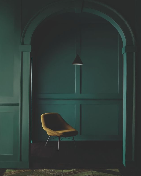
A serene bathroom environment by Otto Tiles, inspired by ‘summer’ using artisan tiles in desaturated shades
Uncovering our colour personality, or season i.e. spring, summer, autumn or winter is a great place to start when it comes to decorating our interior, and it’s related to the type of feeling and aesthetic we’re generally drawn to in our every day lives. Which bunch of flowers do we tend to reach to out of habit? Which pastel shade of macaron gives us the most pleasure? What colour do we like to paint our nails?
Maybe you like cosy warm tones, surrounded by cushions, throws and piles of books? Or, you may dislike clutter, feeling much more at home in a minimal, pared-back environment with one or two statement pieces of furniture? So many questions! But the answers are going to help you discover your season.
Once you have unveiled your colour personality, interior scheming will become so much easier, and when you understand why you choose what you do, the process becomes natural. You will then select palettes that match your true identity, supporting you emotionally and therefore giving your surroundings a deeper meaning (which is what we’re all about at LLG.)
How can we choose colours that are in harmony with each other?
The process of discovering your ‘season’, is to understand how you truly react to colour, texture and light, to create a considered space. You can then select colours from your palette to create an environment that doesn’t just look good, but more importantly reflects your personality, and how you want to feel in that room.

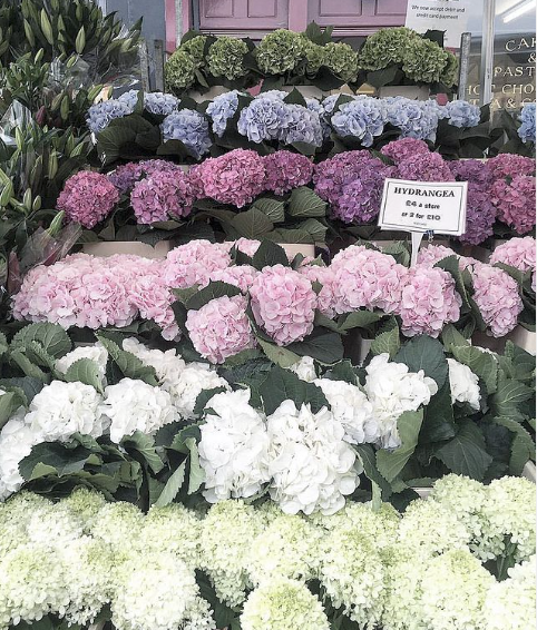
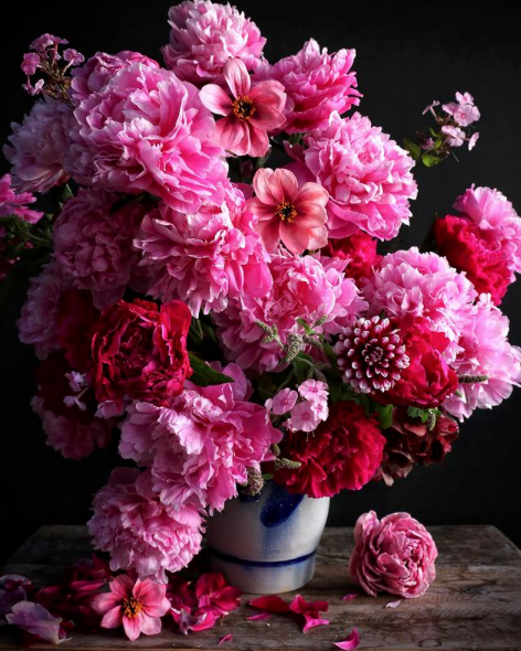
Understanding the flowers and the colours that you’re drawn to in nature can also help uncover your true season
If you’re in the process of renovating your home from top to bottom, finding your season can really help to create flow and cohesion easily around the home. It empowers you to make confident, informed decisions with your design concepts and therefore your purchases, which by default will also result in less waste; financially and materialistically.
We don’t just look at our homes, we feel them, they are experiential, sensory, all-encompassing. What is cosy and warm to a friend might be sterile and cold to you, so its really important to channel your true passions at home by finding Your colours.

The colour wheel is a great starting point, and finding your season will really help with your design confidence
Getting our heads around ‘tonal’ colour harmony is a decorating game changer. It’s not about focusing on the fact that we love pink, for example, it’s how that particular pink will look when teamed with other hues. You’ll discover that colours don’t need to sit next to, or opposite each other on the colour wheel to harmonise, it should be how colour combinations make us feel that steers our choices, rather than what rules to follow. As much as the colour wheel is a great guide to showing us colour palettes that ‘work’, as humans, we might need something a little more complex to match our complex personalities.
So, which season are you?
I’m not going to make you take a test right now… that’s what my Digital Interior Design Service is for! Just have a read through the descriptions below, and remember to stay open minded, you might be surprised at the answer!
You may be ‘in-between’ seasons and fall into two, for example mainly autumn with a hint of spring. This is very likely as we tend to be drawn to certain palettes, but then a different way of styling, in which case you could base your palette around the hues you feel more strongly towards, and then borrow elements of the styling from the other season. For instance if you’re drawn to the intense hues of autumn and feel at home with the description but may not go as heavy on the styling, you can borrow from spring styling by maximising on light; using glass accessories, a mixture of lighter-weight fabrics and an abundance of foliage and fresh flowers.
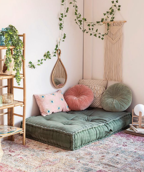
Spring/Playful
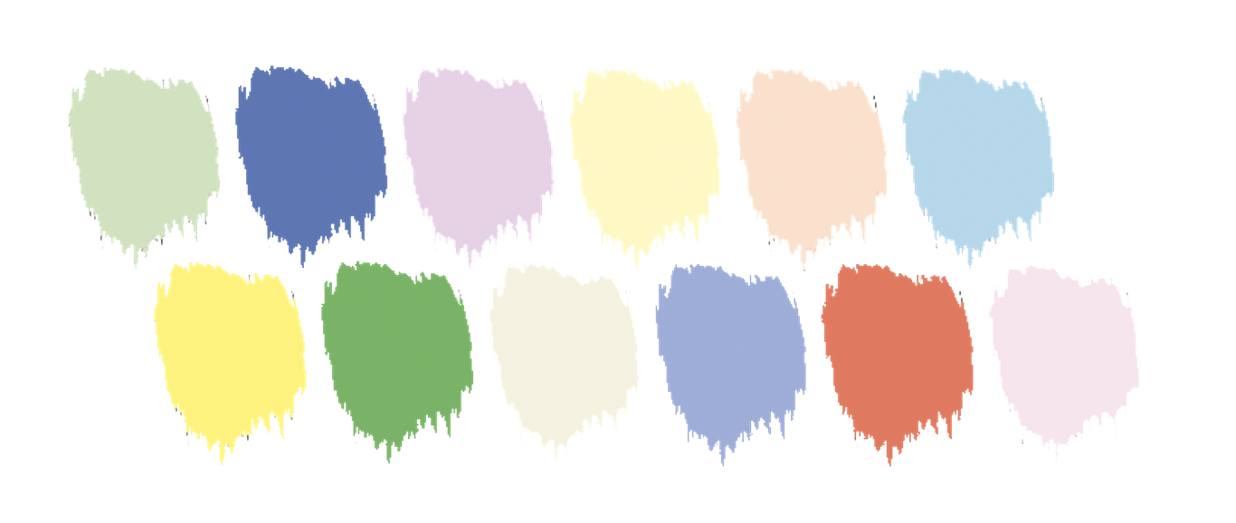
Spring palette
The spring season is all about: energy, new life, optimism and excitement. The palette we see blooming around us is delicate, but vivid and fresh.
The spring personality is: upbeat, fun, energising, creative, inspirational, people lovers, light-hearted, joyful, approachable, welcoming, fresh, lively, optimistic, bubbly, busy, trendy, inclusive, expressive, youthful, friendly, cute and uplifting.
The colours in the spring palette are yellow based which gives them their warmth, and the exclusion of black achieves their clarity and freshness. The colours themselves have a jovial, bouncy feel to them which we associate with springtime. The palette embodies spaciousness and warmth with the delicate, but bright colours.
Colours include: watermelon red, apricot, baby blue, aquamarine, lilac, cream, vanilla, sunshine yellow, apple green, coral, baby pink, lemon sorbet and camel.

The dining room of Cathrine de Lichtenberg who uses the spring palette beautifully, with fresh, minimal, joyful styling.
Tips for spring styling
The use of voiles in place of heavy curtains, light-coloured floors, fine lined furniture and reflective surfaces are key to allowing as much light into the space as possible. Propping would be busy but light; glass vases with fresh flowers, and lots of plants and sentimental displays with a strong connection to the outdoors, including the use of botanical prints.
Spring styling inspiration via Sophie Robinson, borrow the interesting floral arrangement, jovial paint choices and chintzy floral patterns to achieve the fresh, layered look in your home.
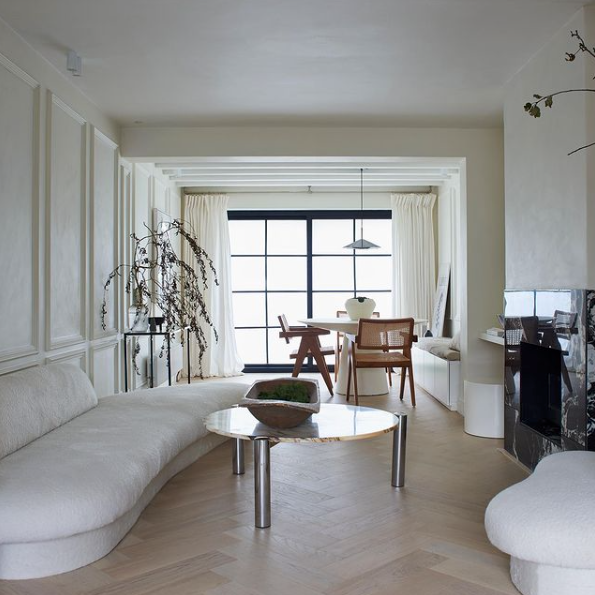
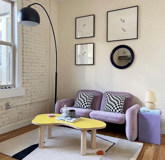
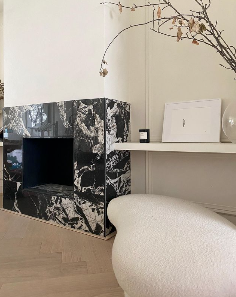
Summer/Serene

Summer palette
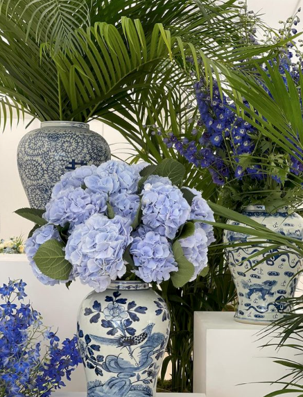
If we think about the natural landscape in the summer season, it’s much softer, bigger and blousy. Imagine those large dusky summer flowers, like hydrangeas, wisteria, lavender and antique roses; the colours are greyer than they are in spring, as they’ve been faded by the sun. They are subtle and understated.
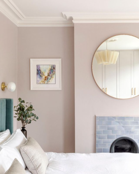
The energy is far less busy than spring, nature takes time out to relax and laze, like we do, at garden parties, holidays, and lazy weekends outdoors. This is a much slower paced season, and oozes elegance.
The palette is subdued, bleached-out and chalkier, with mid-tone, cool colours due to the addition of grey which lowers the colour temperature, although conversely, the temperature outside is higher. This blue/grey-base gives the colours their laid-back and sophisticated vibe. We’ve moved from the youthful, playful energy of bouncy spring, to the relaxed, soft mood of a lazy summer’s afternoon.
Colours include: rose pink, plum, dried sage, washed denim, dusky lavender, mauve, taupe, oyster white, chalky teal and maroon.
Borrow from the bleached wooden floor, cotton textures and desaturated greens for the summer feel
The summer personality is more reserved than spring; cool, calm, collected, classic, graceful and understated. They are detail orientated, responsible and peaceful, and don’t need to shout about their home interior. It’s quietly confident and well ordered, just like the homeowner.
Tips for summer styling
To achieve such easy elegance, try mid-tone colours in fabrics like linen, organza, cashmere and velvet in washed-out hues. Less pattern is more for the understated look, with a greater onus on texture and patina. Use bleached out or light wood with plains, and blousy fresh flowers as a centre piece. Invest in classically shaped, soft-edged furniture and comfortable sofas.

Image of Crown x Elle Decoration paint in Satin Lining and Go Green; the deeper colours in the palette are lifted with light weight textures and relaxed styling.
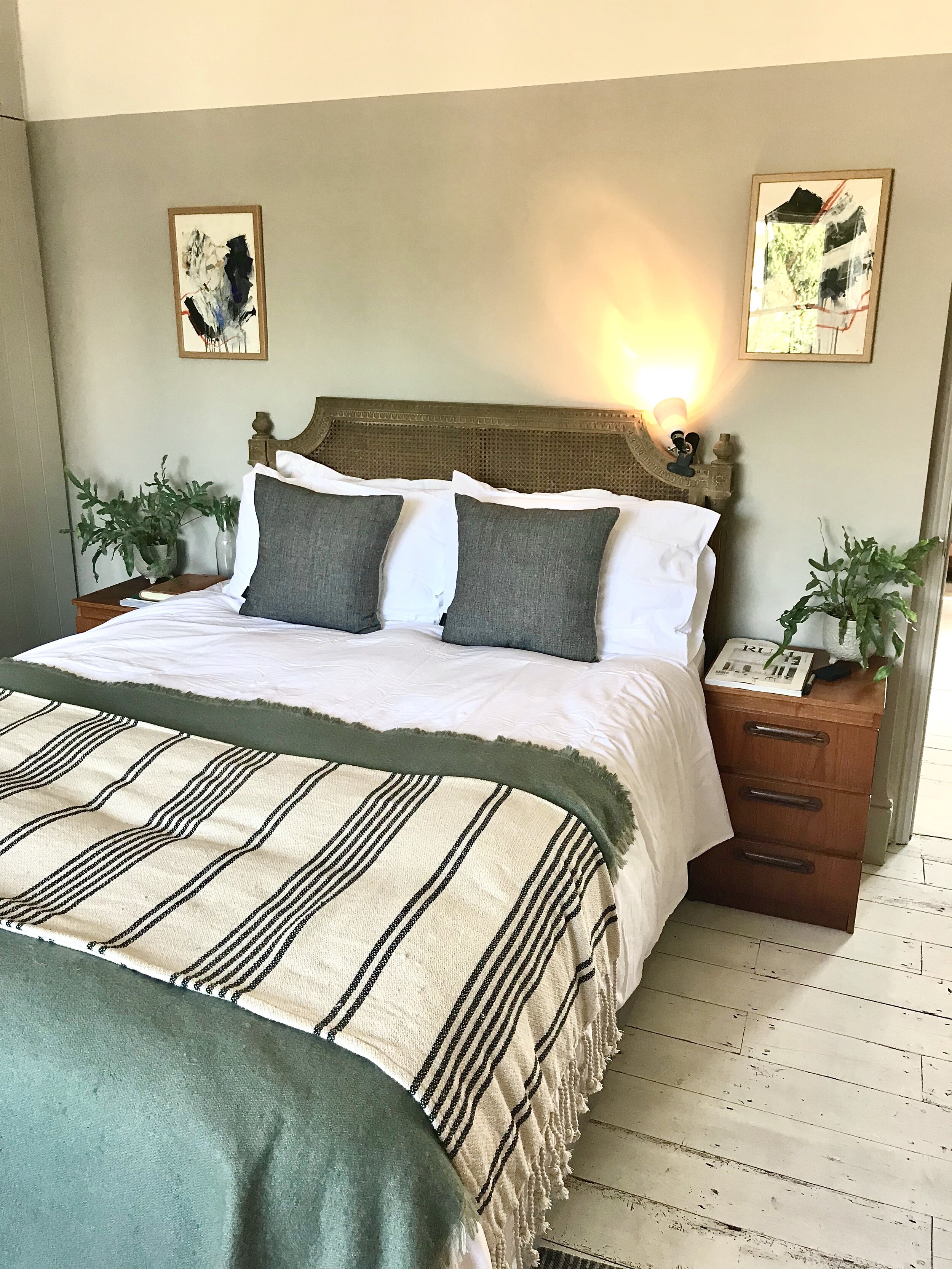
Autumn/Earthy

Autumn palette
The natural landscape is changing. Leaves are transforming into crunchy rich, saturated colours, and hibernation begins. The life-spans of flowers and fruit come to an end, needing time to rejuvenate and replenish. The colour spectrum develops, making way for the fiery, intense hues found in late-blooming flowers like dahlias, chrysanthemums and Chinese lanterns.
The energy is high, we’re sweeping up the fallen leaves and preparing for a change in temperature and light. The soft, muted tones of summer have been replaced by harvest, and the earthy shades and grounding energy we associate with autumn.
Like spring, the colours are yellow-based but have more intensity because of the addition of black, which gives this group their jewel-like depth. Remove the black, and they are the spring colours. The palette is full-power intensity with grounded cosiness.
Colours include: vermillion, caramel, rust, saffron, burnt orange, olive, forest green, teal blue, aubergine, deep pink, sunflower yellow, ivory white, chocolate and stone. They range from gentle and soft to statement and flamboyant.
The autumn personality is strong and passionate, and like the flamboyant colour palette, they can be theatrical and vibrant individuals. They are studious and big on history, so tend to be drawn to renovations due to their sense of responsibility to craftsmanship and the past. They have an affinity to nature, and conscious about the planet.
This authentic bunch steer away from mass production and prefer rustic and robust, preferably handmade items with character and texture. Their love for heritage means they’ll will hunt down second hand pieces that have a story to tell, and because of this they are collectors.
Tips for autumn styling
Look to the past for inspiration; texture, artisanal fabrics and wallpapers are key, as are handmade, statement pieces of furniture that show the knocks of life. ‘Casual and cosy’ can be achieved with lots of wool, sisal and timber, and importantly, teamed with the intense autumn colour palette. It’s important to the autumn personality to have a real fire, layered, cocooned lighting and a library of books. They are not interested in trends, these quirky rule breakers have a strong sense of style that transcends seasonal trends.

The home of Mary Portas via Elle Decoration UK, showcasing how a richly stained wood adds character, warmth and cosiness.
Winter/Minimalist
Winter palette
During the winter season the landscape boasts impressive, extreme dramatic scenes, like the blinding sun against bright white vistas. This is the time when everything shuts down and hibernates, as a lot of nature cannot survive.
Winter personalities are stark and striking just like this landscape. They are extreme and live for drama. They make design statements in their homes by using bold primary colour, geometric patterns, a strong use of black, and iconic pieces that show status. Their interior will take no prisoners, they are entirely committed to the look and they don’t care what others think because they are decisive and self-assured.
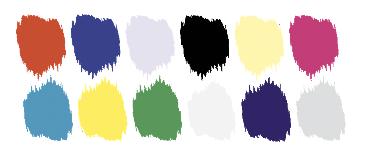
Colours include: black, white, magenta, pillar box red, citrus yellow, pistachio, ice blue, pure grey, royal purple, Yves Klein blue shocking pink, charcoal, silver, chrome and midnight blue. There is a sense of power and punch to the colours; it’s the only palette that includes pure white and pure black.
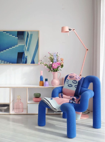
Winter personalities are decisive, single minded, visionary and successful. You don’t only like making money, you like to shout about it. You’d buy an overstated, brightly coloured sports car, or maybe a one of a kind electric guitar, that you might not be able to play, to show people that you’re aspirational and extravagant. You’re an early adopter, interested in new technology before anyone else you know has it.
You’d actually be good at faking that you have money even if you don’t!

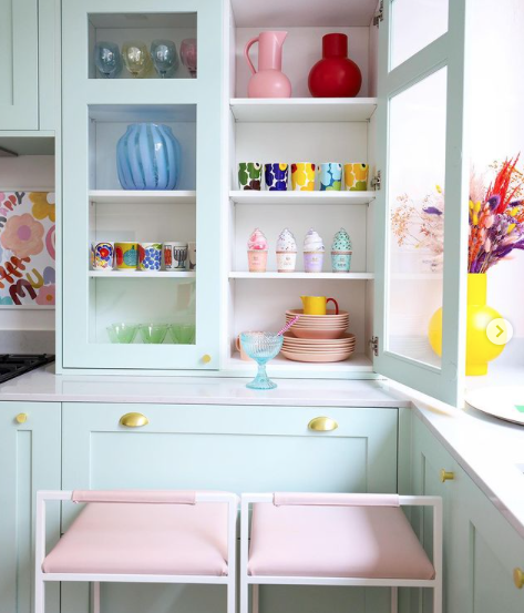
Kitchen of Lera Brumina
Tips for winter styling
It would be strong, but minimal, using hard lines, graphic prints and bold colour to accentuate architectural details. Think Kanye and Kim’s home, we’re talking an enormous space with no styling. They’re so rich that they don’t need to show or prove anything. But it’s not all about a big white empty box, Kit Kemp & Jonathan Adler take a winter approach to their interiors with their use of a restrictive palette, expressive prints and noteworthy furniture choices

Image via Jonathan Adler
So, are you surprised by your season or did you know all along?
Those of you who know me will know that I’m a true autumn personality. Lover of all things old and wrinkly, knocked and pre-loved with a story to tell, and to dramatic, saturated colours, any many of them! This is why my home renovation will be slow. I’m more driven by doing things properly and investing in quality (therefore lots of saving up to do!) rather than quickly rushing to the ‘finished line’ - whatever that is. I don’t think my home will ever be finished, I think it will evolve and grow organically as I do, over a long period of time, and therefore support me and nourish my life, and my habits while at home.
Do get in touch if you’re finding it tricky to discover your season, and therefore, the colours for your home interior. This is something I can help you with, designing a bespoke space that is completely fitting to your needs and personality.